Half-width link blob
The half-width link blob is used on higher-level template pages to help preview and lead users to content deeper within the section. The two column layout utilizes extra screen real estate found on larger breakpoints.
The 50/50 image and text component is a variation of the half-width link blob that uses imagery.
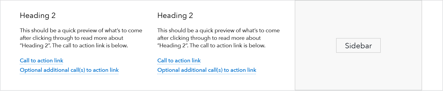
A pair of half-width link blobs, as seen on a landing page template:
Use case
When to use
- Default option for providing succinct descriptions and navigation path to child pages from a parent page.
- Ideally, when an even number of these components can be featured together.
When other options are better
- When content requires imagery. Suggest using the 50/50 image and text or 25/27 image and text component instead.
- When there are multiple paragraphs of copy
- When we are not implying a parent/child relationship between the current page and the linked page
Behavior
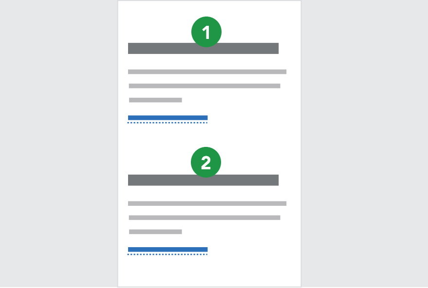
At breakpoints below 601, the two-column pattern transitions into a single column and stacks each instance in Z-order.
Breakpoints 601+ (2 column)
Breakpoints 600 and less (1 column stacked)
Content guidelines
- Headings should be as succinct as possible, ideally 1 line at max column width (25 characters) or two lines at max column width maximum (50 characters).
- Description beneath heading should also be succinct, roughly 3-5 lines at max column width of text (100-250 characters).
- Call to action link should stay on a single line at max column width; 40 characters or less. Link content should follow link guidelines.
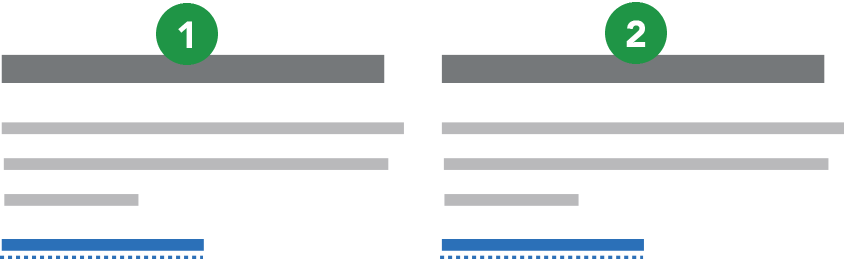
- When these components are featured together (which is ideal), the amount of content in each component should be as close to the same number of total lines as possible; one or two lines different is ok, but the components look best as a grouping when they are the same height.
Style
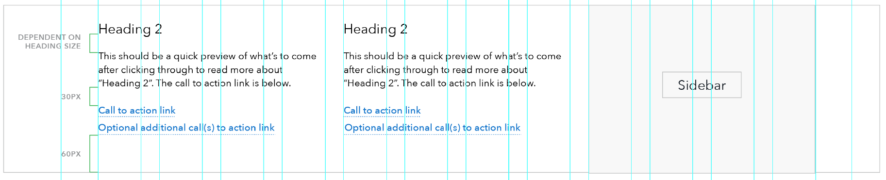
- Headings: Any heading size may be used, recommend H2-4.
- Body copy: Avenir paragraph.
- At breakpoints below 601: Heading sizes H3 and above automatically drop down one level and the mobile link style is used for the call to action link(s).